Prompt AI Better With Task Starters, Not Blank Boxes
Prompt AI better by replacing blank boxes with task starters. Diagnose prompt friction and design AI UX that gets users to useful output faster.
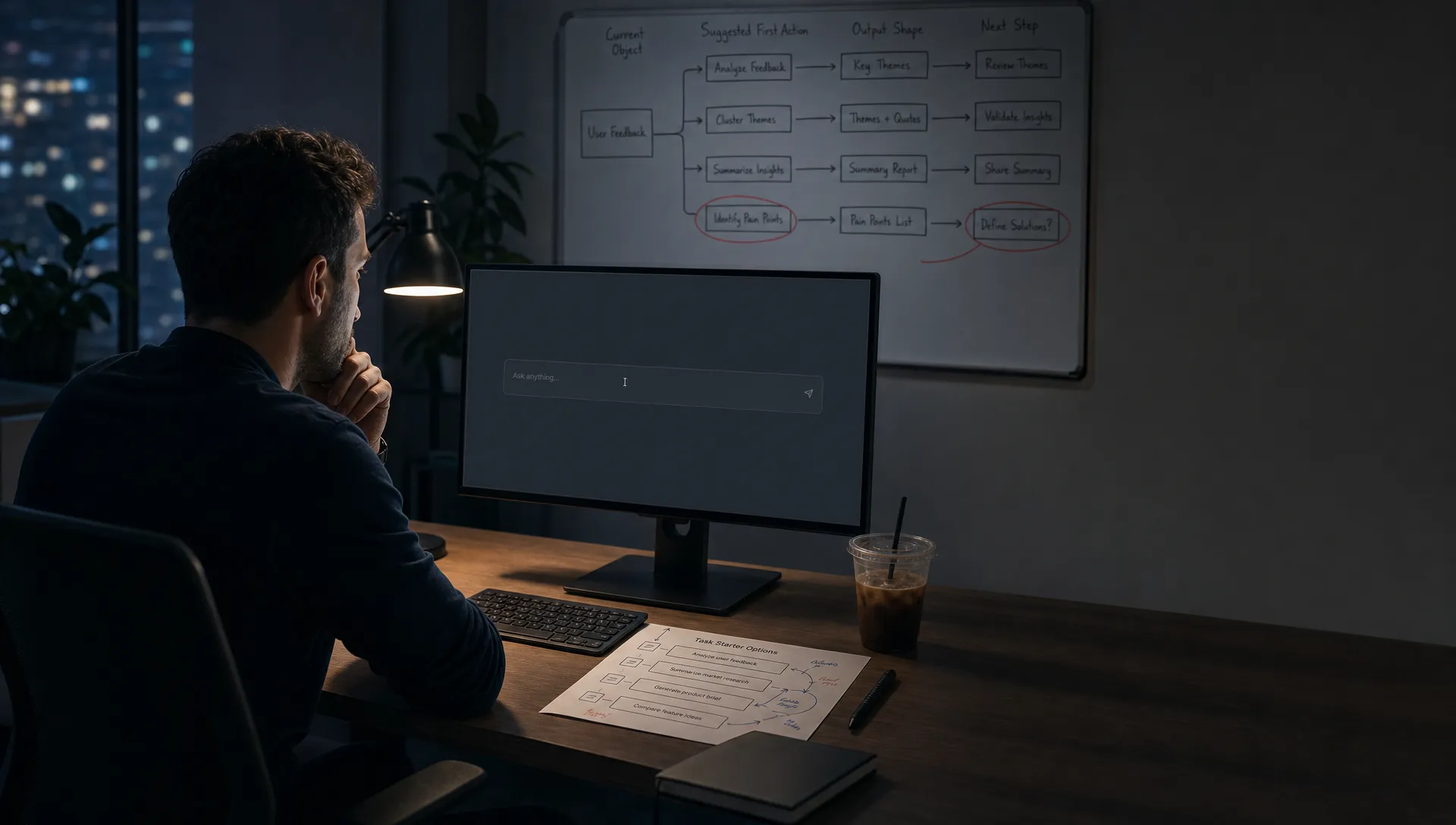
Your AI feature is not failing because users cannot write perfect prompts. It may be failing because the first thing they see is an empty box.
The pattern is easy to miss. The AI panel opens. The cursor blinks. The user pauses, types something vague, deletes it, tries again, then leaves. In analytics, this shows up as prompt-start drop-off, low first-submit rate, or a pile of one-off exploratory prompts that never become a habit.
That is not a user education problem. It is usually a task definition problem.
When you ask users to prompt AI from scratch, you ask them to do product work your interface should have done already. They have to decide what task is possible, what context matters, what output format they want, how specific to be, and how to judge the result. That is a lot to ask before they have seen value.
Task starters fix a different problem than prompt tips. They do not teach users to become prompt engineers. They give users a useful first move.
The blank prompt box is not neutral
A blank box looks flexible to the team that shipped it. To the user, it often looks like homework.
This is especially true inside an existing workflow. A user is not sitting there thinking, I would like to prompt AI now. They are trying to reply to a customer, clean up a roadmap note, summarize research, write a launch email, compare options, or make sense of a messy thread.
The more context your product already has, the worse a blank box can feel. If the user is inside a support ticket, the product knows the customer issue. If they are inside a document, the product knows the draft. If they are inside an analytics view, the product knows the metric and time range. Asking the user to restate all of that into a prompt is avoidable friction.
This is a classic recognition over recall issue. Nielsen Norman Group describes recognition rather than recall as a core usability principle because users move faster when the interface makes relevant options visible. Blank AI boxes do the opposite. They hide the next move and force recall.
If your users freeze before typing, the problem may start even earlier than the box itself. That broader pattern is covered in why AI prompts fail before users even type. This article focuses on the narrower fix: replace blank starts with task starters.
Task starters are not example prompts
A task starter is not a prompt template pasted above the input.
It is a product decision that says: given where the user is, this is a likely job, using this context, producing this kind of output.
Good task starters are tied to the current object. In a support tool, that object might be the ticket. In a docs product, it might be the selected section. In an analytics product, it might be the current chart. In a design tool, it might be the selected component.
The starter should reduce uncertainty, not add decoration. A button that says Brainstorm ideas is weak because it does not tell the user what kind of ideas, for what purpose, or from what input. A button that says Turn this customer thread into a concise reply is stronger because the task, source, and output are visible.
This is the shift: do not start with what the model can do. Start with what the user is already trying to finish.
Diagnose whether you have a prompt problem or a task starter problem
Before redesigning the input, check the behavior. The same low usage number can come from very different breaks.
| What you see | Likely break | Better response |
|---|---|---|
| Users open the AI surface but do not submit | They do not know what task to ask for | Show task starters based on the current workflow |
| Users submit very short prompts like help or summarize | The product has not named useful tasks | Offer specific starters with object and outcome |
| Users copy prompts from docs or teammates | The prompt box is doing too much work | Move common prompts into native UI actions |
| Users get a first output but rarely reuse the feature | The first task is interesting but not routine | Anchor starters to recurring workflow moments |
| Users edit the prompt many times before submitting | They are negotiating with the interface | Prefill context and constraints before the prompt |
| Users accept outputs only after heavy rewriting | The starter points to the wrong output shape | Redesign the starter around the final use case |
The key question is simple: does the user know what job this AI surface is for at this moment?
If not, better prompting advice will not fix it. You need a better starting action.
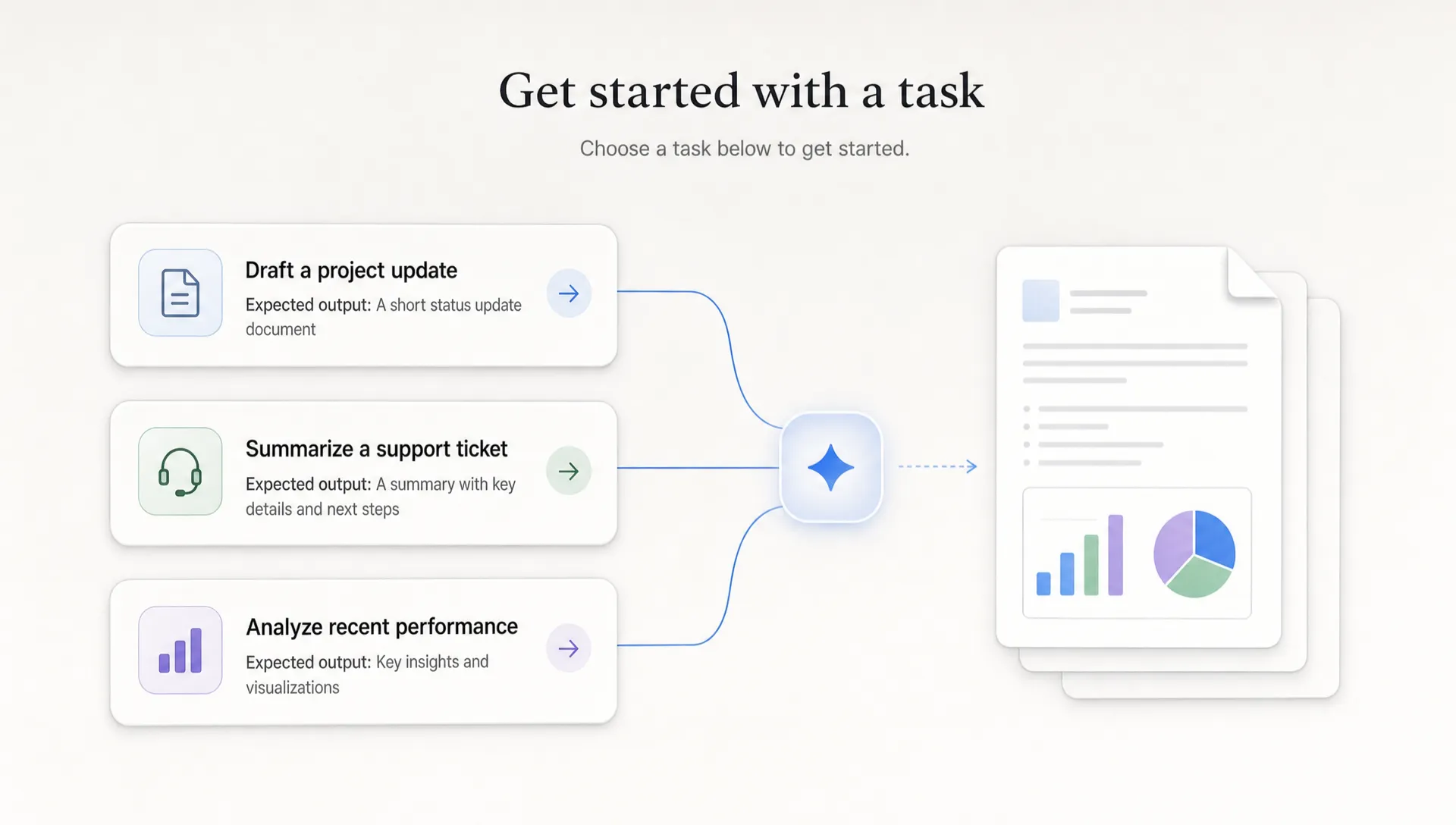
Design task starters from the current object
Most weak AI starters are too generic because they are written from the model outward. Summarize. Rewrite. Brainstorm. Analyze. These verbs are not wrong, but they are unfinished.
A useful starter combines five parts:
- The object: the thing the user is working on, such as a ticket, draft, table, call transcript, design, or issue.
- The action: the job the user wants done, such as shorten, compare, explain, classify, reply, extract, or convert.
- The constraint: the rule that makes the output usable, such as for an executive audience, under 100 words, based only on this thread, or in our launch tone.
- The output: the format the user can act on, such as reply, checklist, summary, decision memo, SQL draft, release note, or bug report.
- The next step: what the user can do after generation, such as insert, send, assign, edit, verify, or share.
You do not need all five in the label. But the product should know all five.
For example, Generate content is vague. Draft a customer-ready reply from this thread is a task starter. It names the object, the action, and the output. It also implies the next step: review and send.
Good task starters have opinionated verbs
The verb matters because it frames the user’s expectation. Generic verbs invite generic outputs. Opinionated verbs point the model and the user toward a result that fits the workflow.
| Surface | Weak starter | Better starter | Why it works |
|---|---|---|---|
| Customer support | Summarize | Extract the customer’s issue, attempted fixes, and next best reply | It maps to how agents handle tickets |
| Product docs | Improve this | Rewrite this section for a new user who has not used the feature before | It adds audience and purpose |
| Analytics | Analyze chart | Explain the signup drop from last week using the visible segments | It uses current context and a clear question |
| Sales CRM | Write email | Draft a follow-up email based on this call note and open objections | It connects output to deal motion |
| Design tool | Create variants | Generate three shorter CTA options for this selected button | It is bounded and directly usable |
Notice that the better starters are not longer because longer is better. They are longer because they remove decisions the user should not have to make from scratch.
Do not turn starters into a prompt template library
A prompt template library often becomes a junk drawer. It starts useful, then fills with generic examples that are detached from the user’s current work.
That creates a second search problem. The user now has to choose between templates, adapt one, paste context, and hope it fits. You have moved the blank box one step back, not removed the friction.
Task starters should live where the task happens. If the user is viewing a churned account, show starters for churn analysis and save-plan drafting. If the user is editing a release note, show starters for clarity, completeness, and audience fit. If the user is inside a backlog item, show starters for acceptance criteria, edge cases, and dependency checks.
This is also where many onboarding fixes fail. Teams add a carousel of sample prompts during first run, but the user forgets them by the time a real task appears. If your onboarding has this symptom, the issue may be closer to empty prompt paralysis in AI onboarding than to feature awareness.
Where the blank box still belongs
Do not delete the prompt box entirely.
Power users need room to ask unusual questions. Edge cases will not fit your starters. Some users want to combine tasks in ways your team did not predict.
The mistake is making the blank box the first required move for everyone.
A better pattern is progressive freedom. Show a small set of task starters first. When the user selects one, open an editable prompt or instruction field that is already grounded in the task. Let the user modify the audience, tone, format, or constraint. Keep the escape hatch for freeform prompting, but do not make it the main path for activation.
This helps two groups at once. New users get traction without learning prompt syntax. Advanced users get a faster starting point they can bend.
What to measure after shipping task starters
Task starters are not a UI polish project. Treat them as an adoption experiment.
Do not only measure clicks on the starter. A starter can get clicks because it is visible, then still produce output users abandon. Measure whether it changes the full path from intent to reuse.
| Metric | What it tells you | Watch for |
|---|---|---|
| Starter selection rate | Whether users recognize the task | High selection with low acceptance means the label is promising the wrong thing |
| First output acceptance | Whether the starter produces a usable result | Low acceptance means context, constraint, or output shape is wrong |
| Edit depth before generation | Whether users trust the starter setup | Heavy edits may mean the starter is too broad |
| Insert, send, or save rate | Whether output reaches the workflow | Low downstream action means the output is not operational enough |
| Repeat use by surface | Whether the task becomes routine | One-time use means the starter may be interesting, not habit-forming |
The best starter is not the one users click once. It is the one they come back to because it saves a real step in a recurring workflow.
Frequently Asked Questions
What is a task starter in an AI product? A task starter is a predefined starting action tied to the user’s current workflow. It names a useful job, uses available context, and points toward an output the user can act on.
How is a task starter different from a prompt template? A prompt template is usually a reusable text pattern the user adapts manually. A task starter is embedded in the product at the moment of need and should already know the relevant object, context, and output path.
Should every AI feature avoid blank prompt boxes? No. Blank boxes are useful for exploration and advanced use. The problem is making a blank box the default first step when the product already knows what the user is likely trying to do.
How many task starters should an AI surface show? Usually fewer than you think. Start with three to five high-confidence tasks tied to the current object. Too many starters can create the same paralysis as a blank box.
What is the fastest way to choose task starters? Look at repeated user workarounds. Support macros, copied prompts, saved snippets, manual summaries, and repeated rewrite requests are strong signals for starter candidates.
Make the first move easier
If users are staring at a blank prompt, do not start by teaching them how to prompt AI better. Start by asking what task your product failed to name.
Pick one high-intent surface. Replace the blank first move with three task starters grounded in the current object. Measure first output acceptance, downstream action, and repeat use. Keep the freeform prompt as an escape hatch, not the default path.
If you want to diagnose whether your issue is prompt paralysis, trust, weak output fit, or missing habit, run a quick symptom-based triage. For a deeper operating system, the AI Product Adoption Deck includes 104 cards, 12 diagnostics, and 12 workshops for turning adoption symptoms into concrete product decisions.